Vintage Maps: Unterschied zwischen den Versionen
Aus Geoinformation HSR
HTan (Diskussion | Beiträge) |
HTan (Diskussion | Beiträge) |
||
| Zeile 32: | Zeile 32: | ||
* [http://www.fontsquirrel.com/fonts/Aquiline-two Aquiline] | * [http://www.fontsquirrel.com/fonts/Aquiline-two Aquiline] | ||
* [http://www.fontsquirrel.com/fonts/Mutlu Mutlu] | * [http://www.fontsquirrel.com/fonts/Mutlu Mutlu] | ||
| + | |||
| + | Point-of-Interests | ||
| + | *For a pirate/vintage map, it is important to have plenty of POIs (like bars/restaurants/gardens) and have an "old fashioned" design icon and style it on the map. | ||
See also: | See also: | ||
Version vom 22. Mai 2014, 10:28 Uhr
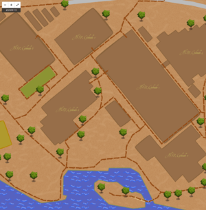
This page tries to collect information about maps visualized in vintage style. This means, they look like an old sketchy map, a treasure map (de: Schatzkarte) or a pirate map (de: Piratenkarte), but with own or actual data.
Treasure/Pirate Maps:
- Treasure Map HSR - A Treasure-Map, created for the [HSR AppQuest 2013 http://appquest.hsr.ch/]: See Making Maps from OpenStreetMap Data.
Showcases and Tipps:
Making boundaries (like from buildings) to make a hand-made effect.
- A ‘sketchy’ look to lines can be achieved by overlaying a number of line attachments with different smoothing values applied. By smoothing higher values, the lines are overlaid using the ‘multiply’ compositing operation. This make areas that overlap more appear darker.
 ::outline1, ::outline2, ::outline3, ::outline4 {
   line-join: round;
   line-color:#773d00;
   line-smooth: 0.05;
   line-width: 0.5;
 }
 ::outline1{ line-smooth: 0.04; }
 ::outline2{ line-smooth: 0.06; }
 ::outline3{ line-smooth: 0.08; }
 ::outline4{ line-smooth: 0.10; }
Suitable fonts/typefaces:
Point-of-Interests
- For a pirate/vintage map, it is important to have plenty of POIs (like bars/restaurants/gardens) and have an "old fashioned" design icon and style it on the map.
See also:
- OpenStreetMap based on art maps
- Really old maps...: OldMapsOnline.org.
